Select Dropdown
A native HTML <select> dropdown — customers pick one option from a collapsed list. Best when you have many choices and want to save vertical space on the product page.
When to Use
- Size or capacity selections (e.g. 16GB, 32GB, 64GB)
- Turnaround time or service level selection (e.g. Standard, Rush, Express)
- Dropdown menus with 4+ options where open radio buttons would feel cluttered
- Any single-choice decision that needs to fit into a compact space
Configuration Settings
When you add a Select field in the Addon Builder, you can configure the following inputs across different sections:
General Settings
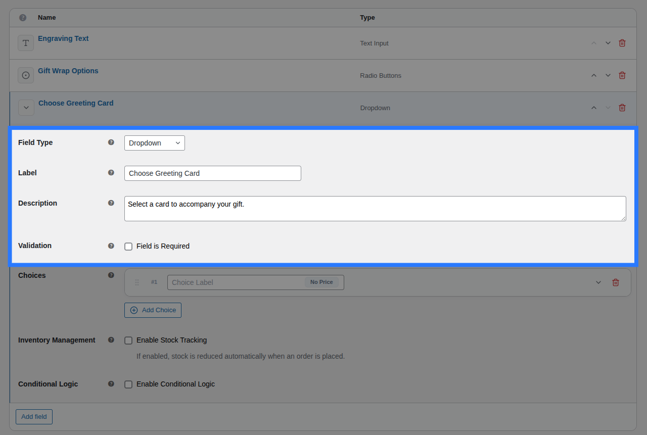
- Label: The text heading displayed above the dropdown. Used to identify the field in the cart and order details.
- Description: Additional helper text shown below the dropdown. Useful for providing instructions.
- Placeholder: The default "—Choose an option—" text shown inside the dropdown before a selection is made. Customize it here (e.g. "Select your RAM size…").
Options Configuration
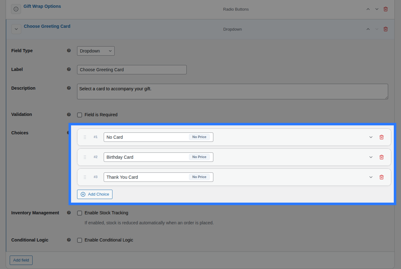
Within the main Options block, you define the actual dropdown choices by clicking the Add Choice button. For each choice card in the list, you have access to inline inputs and an expandable settings panel.
Inline Editor (Always Visible):
- Drag Handle: Use the left-side grip icon to drag and drop choices to reorder how they appear on the frontend.
- Label: The primary text shown inside the dropdown menu on the frontend, and in the cart (e.g.
16GB RAM). - (System Value): Smart Product Options and Addons automatically generates a system-friendly
valuebehind the scenes by lowercasing your Label and replacing spaces with underscores.
Expanded Settings Panel: Click the downward chevron icon on the right side of any choice card to expand its advanced settings:
- Price Type: Choose how this specific option is priced (
None,Flat Fee,Percentage, orFormula). Read the Pricing Guide → - Price Amount / Formula Expression: Appears if a price type is selected. Enter the monetary surcharge or the dynamic math formula.
- Weight (kg): Enter a numeric value to add physical shipping weight to the cart when this option is selected.
- Stock Tracking: A toggle that, when enabled, opens the per-option inventory controls. Read the Stock Linking Guide →
- Select Pool: Choose which Global Stock Item to link this choice to.
- Reduction Mode: Choose how stock is deducted (
Per Item Quantity,Per Line Item, orFormula).
Validation
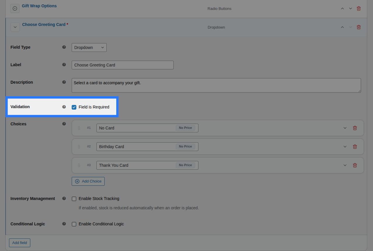
- Field is Required: A checkbox toggle. When enabled, the customer is forced to pick a valid option (they cannot submit the form if the Placeholder is still selected).
Placeholder Rendering
Smart Product Options and Addons automatically renders your placeholder text as the first, disabled <option> in the HTML dropdown list.
Pricing Logic
Smart Product Options and Addons choice fields (like the Select Dropdown) do not support field-level pricing. Instead, pricing is configured individually per option within the General tab under the Options Configuration block.
Option-Level Pricing: Set specific price surcharges on individual choices (e.g., "+$2.00 for Birthday Card") by expanding the choice card and selecting a Price Type:
- Price Type: (None, Flat Fee, Percentage, or Math Formula).
- Price Amount / Formula Expression: The fee applied when this specific option is selected.
Master the Pricing Engine
Smart Product Options and Addons includes multiple pricing strategies, including dynamic math formulas. We've created a dedicated guide to explain all of them in detail.
Conditions
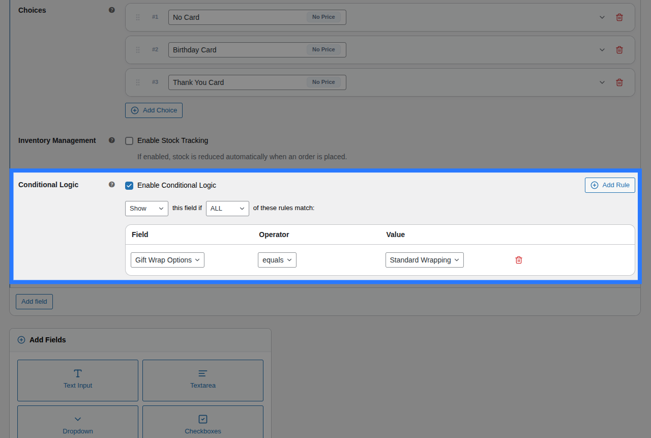
Open the Conditions tab to dynamically show or hide this dropdown based on what the customer has selected in other fields.
Available Inputs:
- Enable Conditional Logic: Toggle to turn conditions on or off.
- Action: Choose whether to Show or Hide this field when conditions are met.
- Match Type: Choose ALL (every rule must match) or ANY (at least one rule must match).
- Rules: Define the specific field to watch, the comparison operator, and the value to check against.
Example: Show the "Engraving Font" dropdown only if the customer checked the "Add Engraving" checkbox.
Learn More About Conditions
Conditional logic lets you build dynamic, branching forms that adapt as the customer interacts. See the full list of operators and examples in our detailed guide.
Stock
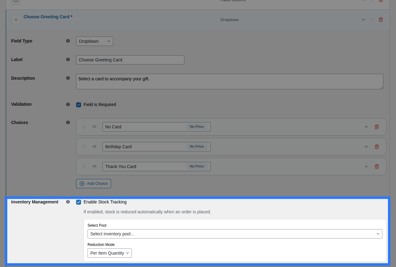
Because a Select field contains multiple distinct options, stock is typically linked per option instead of for the whole field.
Open the Stock tab to link individual choices to their respective inventory pools.
Available Inputs:
- Enable Stock Management: Toggle to activate inventory tracking.
- Per-Option Links: You will see a row for every option you created. For each row, you can select an existing Global Stock Item and define the Reduction Mode (Per Item Quantity, Per Line Item, or Formula).
Option-Level Stock Visibility
If you enable Stock Tracking inside any individual choice card under the General tab, it activates option-level stock. When this happens, the field-level Stock tab shown above is automatically hidden in the backend to prevent conflicting inventory rules.
Global Stock Management
Smart Product Options and Addons lets you share stock pools across multiple options and products, complete with cart-reservation to prevent overselling.
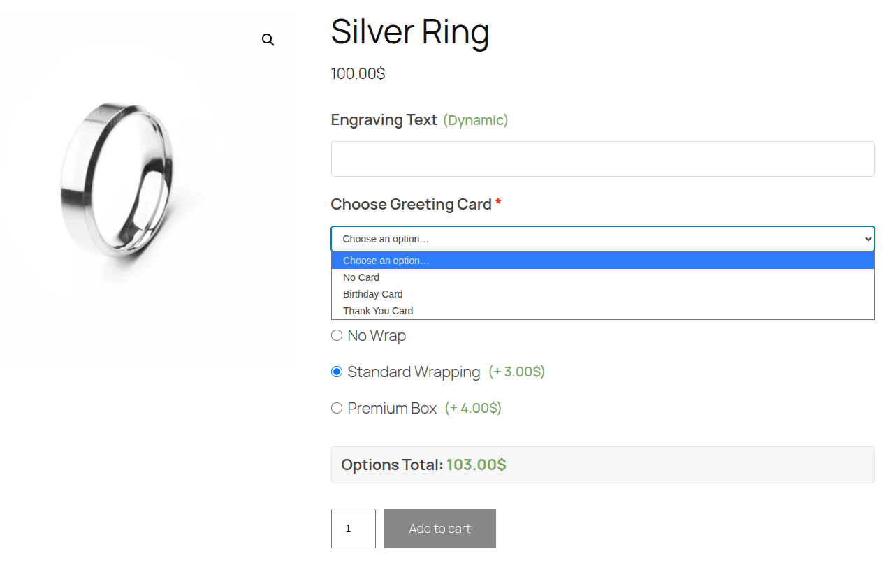
Example & Frontend Display
To see how this comes together, let's look at a common scenario: Selecting RAM size for a custom PC. You want customers to pick one RAM size, and charge a different price based on what they choose.
You would configure the Select field like this:
- Label:
RAM Capacity - Placeholder:
Choose memory size... - Option 1: Label
16GB (Included), Price TypeNone - Option 2: Label
32GB, Price TypeFlat Fee, Price Amount100.00 - Option 3: Label
64GB, Price TypeFlat Fee, Price Amount250.00
Frontend Product Page View: With those settings, here is how the field renders on your product page for customers to interact with:
When a customer makes a selection and adds the product to their cart, Smart Product Options and Addons validates that the submitted value exactly matches one of the allowed options you defined, preventing malicious injections.
Cart & WooCommerce Order View: The field label and the text label of the chosen option (not the system value) will appear clearly on the cart page, checkout, and in your WooCommerce admin order screen exactly like this:
RAM Capacity: 32GB