Checkboxes (Multiple)
A group of independent <input type="checkbox"> elements. Customers can tick any combination of options (zero, one, or many).
When to Use
- "Add-on accessories": Carrying Case (+$10), Screen Protector (+$5), Warranty (+$20)
- "Dietary extras" for food orders
- "Optional services": Installation, Assembly, White-glove delivery
- Any scenario where multiple selections are allowed (unlike Radio Buttons, which only allow one).
Configuration Settings
When you add a Checkboxes field in the Addon Builder, you can configure the following inputs across different sections:
General Settings
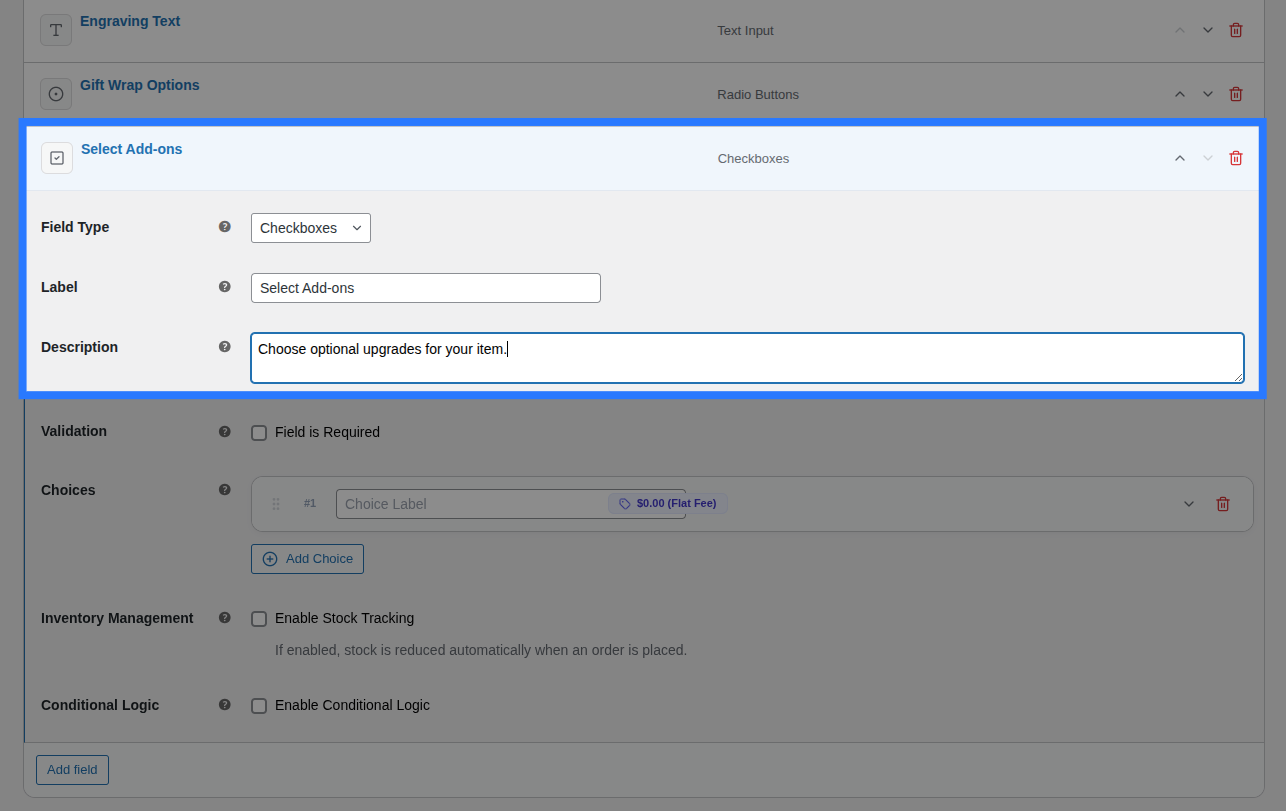
- Label: The main heading shown above the entire group of checkboxes. Used to identify the field group in the cart and order details.
- Description: Additional helper text shown below the group. Useful for providing instructions (e.g. "Select all that apply").
Options Configuration
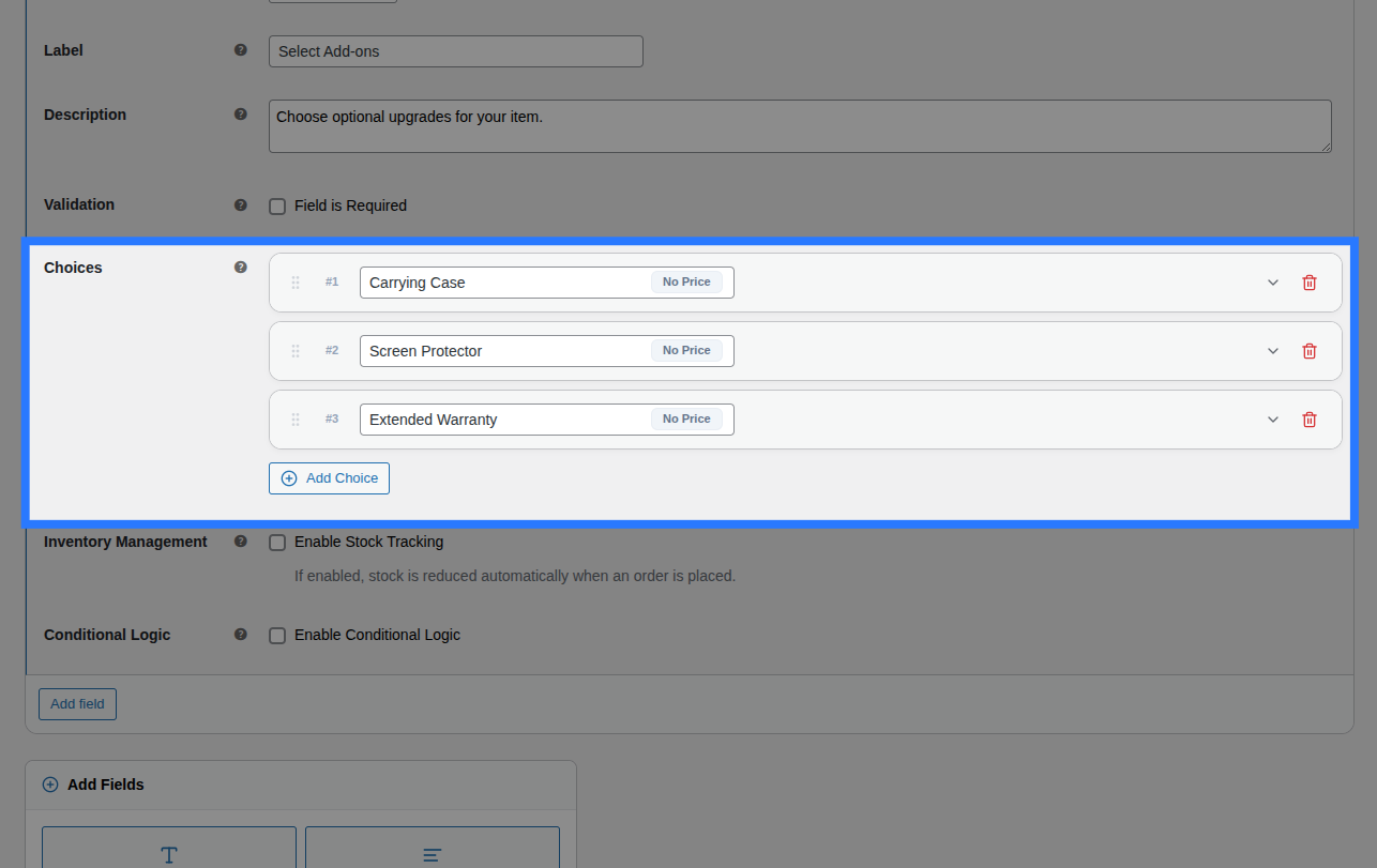
Within the main Options block, you define the actual checkbox choices by clicking the Add Choice button. For each choice card in the list, you have access to inline inputs and an expandable settings panel.
Inline Editor (Always Visible):
- Drag Handle: Use the left-side grip icon to drag and drop choices to reorder how they appear on the frontend.
- Label: The primary text shown next to the checkbox on the frontend.
- (System Value): Smart Product Options and Addons automatically generates a system-friendly
valuebehind the scenes by lowercasing your Label and replacing spaces with underscores (e.g., "Carrying Case" becomescarrying_case).
Expanded Settings Panel: Click the downward chevron icon on the right side of any choice card to expand its advanced settings:
- Price Type: Choose how this specific checkbox is priced (
None,Flat Fee,Percentage, orFormula). Read the Pricing Guide → - Price Amount / Formula Expression: Appears if a price type is selected. Enter the monetary surcharge or the dynamic math formula.
- Weight (kg): Enter a numeric value to add physical shipping weight to the cart when this option is ticked.
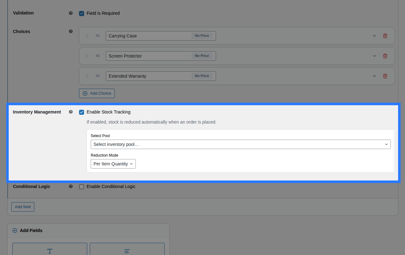
- Stock Tracking: A toggle that, when enabled, opens the per-option inventory controls. Read the Stock Linking Guide →
- Select Pool: Choose which Global Stock Item to link this checkbox to.
- Reduction Mode: Choose how stock is deducted (
Per Item Quantity,Per Line Item, orFormula).
Validation
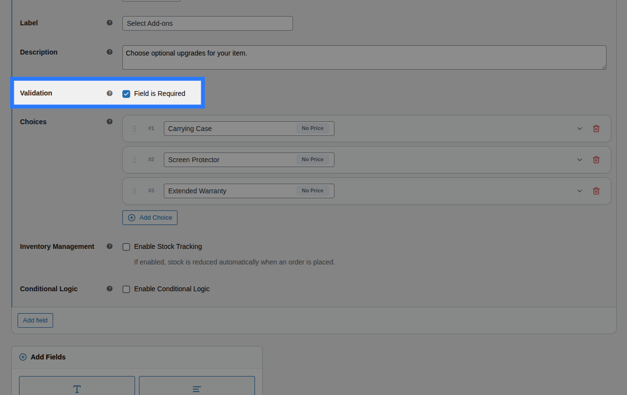
- Field is Required: A checkbox toggle. When enabled, the customer is forced to tick at least one option from the group before they are allowed to add the product to their cart.
Conditions
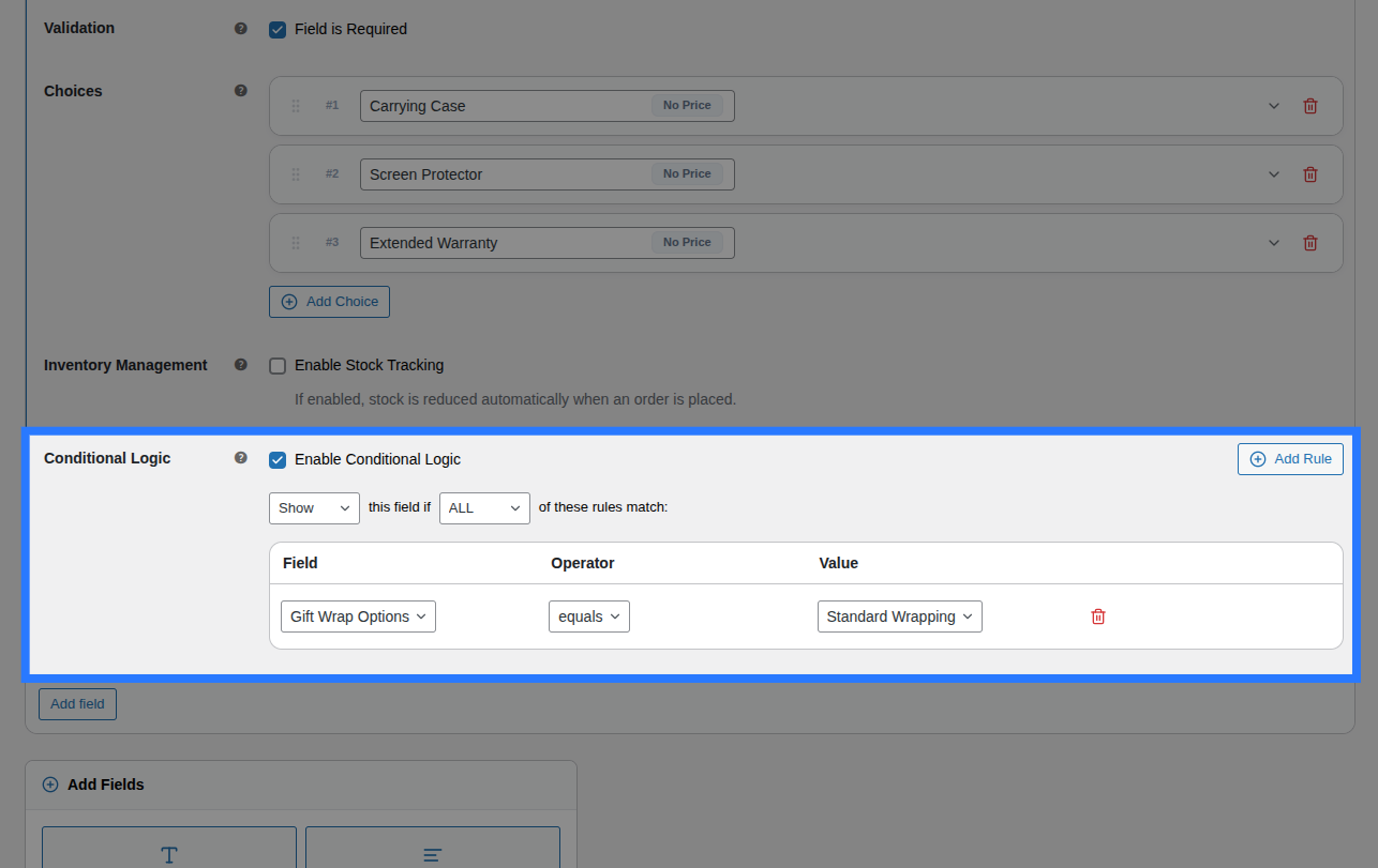
Open the Conditions tab to dynamically show or hide this entire group of checkboxes based on what the customer has selected in other fields.
Available Inputs:
- Enable Conditional Logic: Toggle to turn conditions on or off.
- Action: Choose whether to Show or Hide this field when conditions are met.
- Match Type: Choose ALL (every rule must match) or ANY (at least one rule must match).
- Rules: Define the specific field to watch, the comparison operator, and the value to check against.
Example: Show the "Add-on Accessories" checkboxes only if the customer selects a specific laptop model from a Select Dropdown.
Learn More About Conditions
Conditional logic lets you build dynamic, branching forms that adapt as the customer interacts. See the full list of operators and examples in our detailed guide.
Stock
Because a Checkboxes field contains multiple distinct options, stock is linked per option instead of for the whole field.
Open the Stock tab to link individual choices to their respective inventory pools.
Available Inputs:
- Enable Stock Management: Toggle to activate inventory tracking.
- Per-Option Links: You will see a row for every option you created. For each row, you can select an existing Global Stock Item and define the Reduction Mode (Per Item Quantity, Per Line Item, or Formula).
Option-Level Stock Visibility
If you enable Stock Tracking inside any individual choice card under the General tab, it activates option-level stock. When this happens, the field-level Stock tab shown above is automatically hidden in the backend to prevent conflicting inventory rules.
Global Stock Management
Smart Product Options and Addons lets you share stock pools across multiple options and products, complete with cart-reservation to prevent overselling.
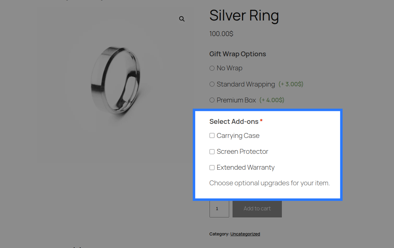
Example & Frontend Display
To see how this comes together, let's look at a common scenario: Selling optional laptop accessories. You want to let customers add multiple accessories to their order.
You would configure the Checkboxes field like this:
- Label:
Add-on Accessories - Description:
Select any extra items you'd like included in the box. - Option 1: Label
Carrying Case, Price TypeFlat Fee, Price Amount25.00 - Option 2: Label
Screen Protector, Price TypeFlat Fee, Price Amount15.00 - Option 3: Label
Extended Warranty, Price TypePercentage, Price Amount10
Frontend Product Page View: With those settings, here is how the field renders on your product page for customers to interact with:
When a customer ticks multiple boxes and adds the product to their cart, Smart Product Options and Addons validates that every submitted value exists in the predefined allowed options list (preventing tampering).
Cart & WooCommerce Order View: The field label and a comma-separated list of the selected option labels will appear clearly on the cart page, checkout, and in your WooCommerce admin order screen exactly like this:
Add-on Accessories: Carrying Case, Screen Protector