The Addon Builder
The Addon Builder is the visual editor where you create and configure Option Groups — collections of custom fields that appear on your WooCommerce product pages. Open it by clicking Add new group on the Option Groups list, or by clicking an existing group's title to edit it.
Builder Layout Overview
The Addon Builder is divided into distinct areas, each serving a specific purpose. Understanding the layout will help you navigate the builder efficiently.
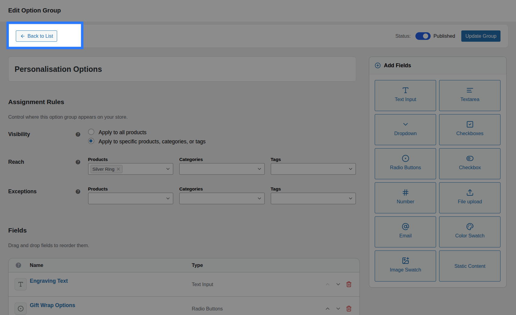
- Header Bar (top): Contains the "Back to List" navigation link, the Publish/Draft status toggle, and the Save button.
- Group Title (below header): A large text input where you name your Option Group.
- Assignment Rules (below title): Controls which products, categories, or tags this group appears on.
- Fields List (main canvas): The drag-and-drop area where your individual fields live. This is where you spend most of your time.
- Add Fields Sidebar (right column): A sticky panel with buttons for every available field type. Click any button to instantly add that field to the canvas.
Mobile-Friendly FAB
On smaller screens where the sidebar scrolls out of view, Smart Product Options and Addons displays a floating action button (blue circle with a + icon) in the bottom-right corner. Tapping it opens a popover with the same field-type grid, so you can always add new fields no matter where you are on the page.
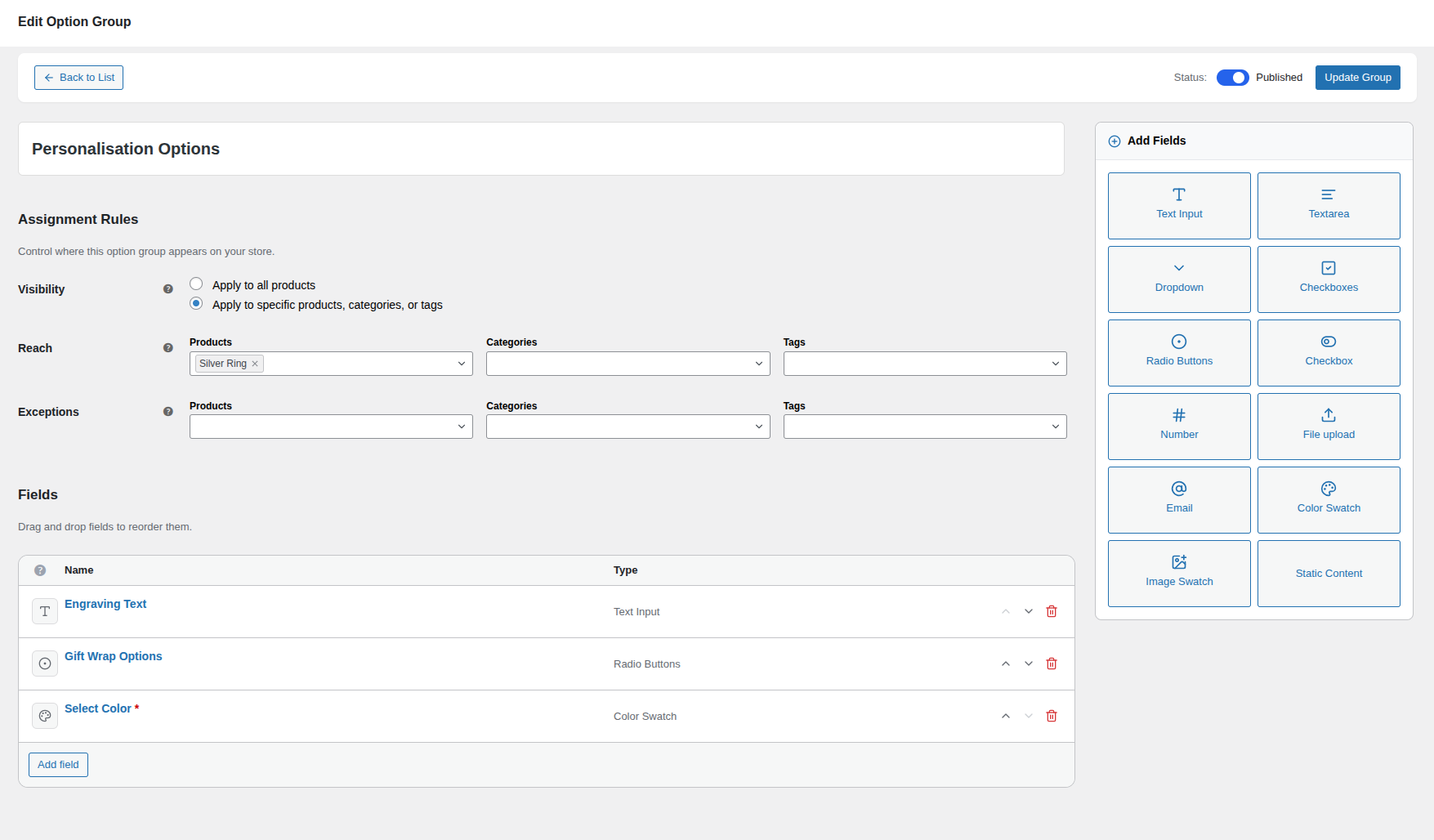
Header Bar
The header bar is always visible at the top of the builder and contains three key controls:
- Back to List: An arrow link that navigates you back to the Option Groups list. If you have unsaved changes, the browser will show a confirmation dialog before leaving.
- Status Toggle: A visual switch to control the group's live status:
- Published (Active): The group is live and visible on product pages.
- Draft: The group is saved but invisible to customers.
- When editing an existing group, toggling the status updates it immediately via the API — you don't need to click Save separately for status changes.
- Save / Update Button: Click to validate and save the entire group configuration. The button label changes depending on context:
- Create Group: When building a new group.
- Update Group: When editing an existing group.
- Saving…: While the save request is in progress (button is disabled).
Setting the Group Title
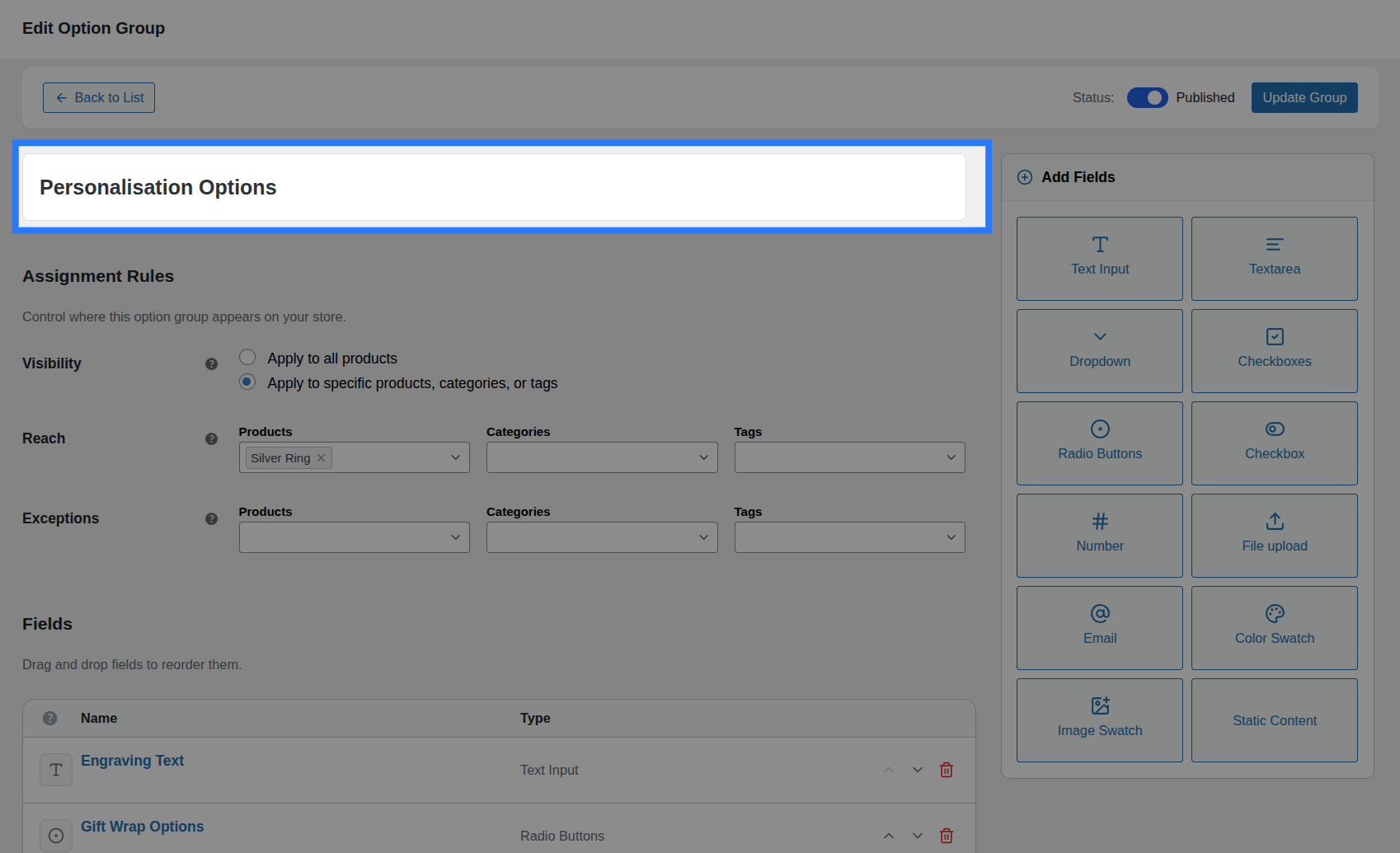
Type the group's name into the large title input at the top. This is an internal label for admin use only — it is never shown to customers on the product page.
- Use a descriptive name that helps you quickly identify the group at a glance (e.g.,
Personalisation Options,Engraving,Gift Wrapping,Material Choice). - The title is displayed in the Option Groups list and in the builder header.
WARNING
The group title is required. You cannot save without one. If you try to save with an empty title, an inline error message will appear.
Assignment Rules
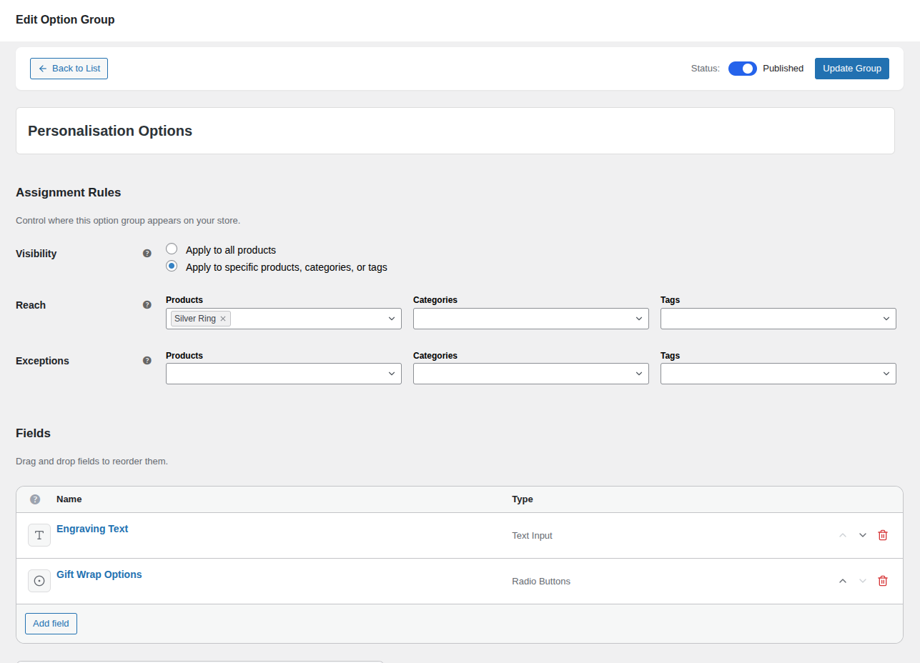
The Assignment Rules panel controls where this option group appears on your store. It is organized into three logical sections:
Visibility
- Apply to all products (Global): The group appears on every single product in your store. This is the default.
- Apply to specific products, categories, or tags (Targeted): The group only appears on the products you explicitly specify. Selecting this option reveals the Reach section below.
Reach (Targeted mode only)
When you choose "Targeted" visibility, the Reach section appears with three searchable multi-select fields:
- Products: Search and select specific WooCommerce products by name.
- Categories: Search and select product categories.
- Tags: Search and select product tags.
You can combine all three — for example, assign a group to the "T-Shirts" category and two specific individual products. The group appears on any product that matches at least one of your selections.
Exceptions
Exceptions are always available, regardless of whether you chose Global or Targeted visibility. Use the same three search fields (Products, Categories, Tags) to exclude specific items.
Example: Apply a "Personalisation" group globally, but exclude the "Gift Cards" category — since gift cards can't be physically engraved.
Learn More About Assignments
We've created a dedicated guide with advanced examples, edge cases, and troubleshooting tips for assignment rules.
Add Fields Sidebar
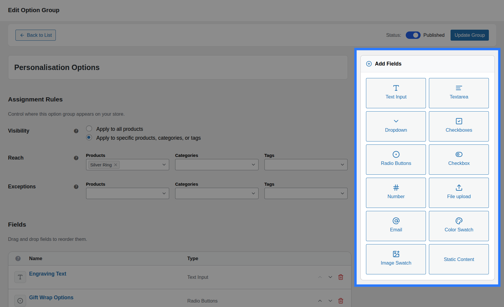
The right-hand sidebar contains a 2-column grid of buttons — one for every field type Smart Product Options and Addons supports. Click any button to instantly add a new field of that type to the bottom of the Fields List.
Choice Fields:
- Dropdown — A native
<select>dropdown for single selection from a list. - Radio Buttons — Inline radio buttons for a single, visually selectable choice.
- Checkboxes — Multi-select checkbox group for picking multiple options.
- Checkbox (Single) — A standalone toggle for yes/no decisions (e.g. "Add Gift Wrapping?").
- Color Swatch — Clickable color circles/boxes that map to hex values.
- Image Swatch — Clickable thumbnail images as choices.
Input Fields:
- Text Input — Single-line free text for names, monograms, short messages.
- Textarea — Multi-line text area for longer messages or notes.
- Number — Numeric-only input with optional min/max/step constraints.
- Email — Email address input with built-in format validation.
- File Upload — Attach a file (artwork, design brief, photo) with configurable allowed types and size limits.
Display:
- Static Content — Output raw HTML for headings, notices, dividers, or informational callouts.
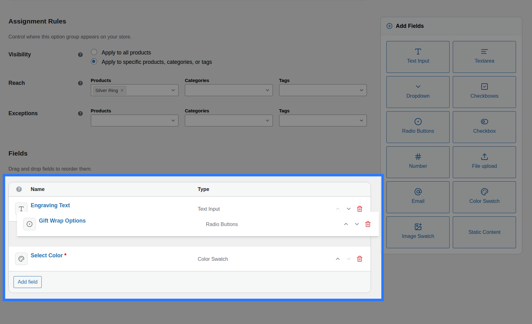
The Fields List
The Fields List is the main working area of the builder. Every field you add appears here as a collapsible card (called a "Field Row").
Collapsed View (Default)
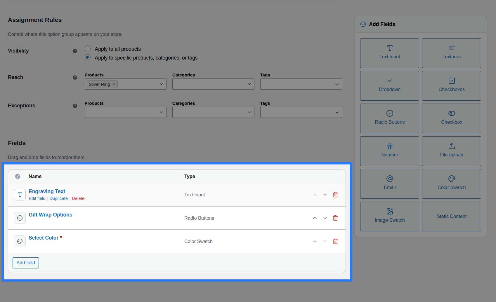
Each collapsed field row shows:
- Drag Handle (⠿): The grip icon on the far left. Click and hold to drag this field to a new position.
- Field Icon: A small icon representing the field type (e.g., a palette icon for Color Swatch, a hash for Number).
- Field Label: The label text you configured for this field (or a placeholder if no label has been set yet).
- Type Badge: A subtle tag indicating the field type (e.g., "Text Input", "Dropdown").
- Expand/Collapse Chevron (▾): Click to open the full configuration panel.
- Delete Button (🗑): Click the trash icon to remove this field from the group.
Reordering Fields
The order of the fields in the builder is exactly the order they appear on the product page. Drag and drop to rearrange them until the layout feels right.
Expanded View (Configuration)
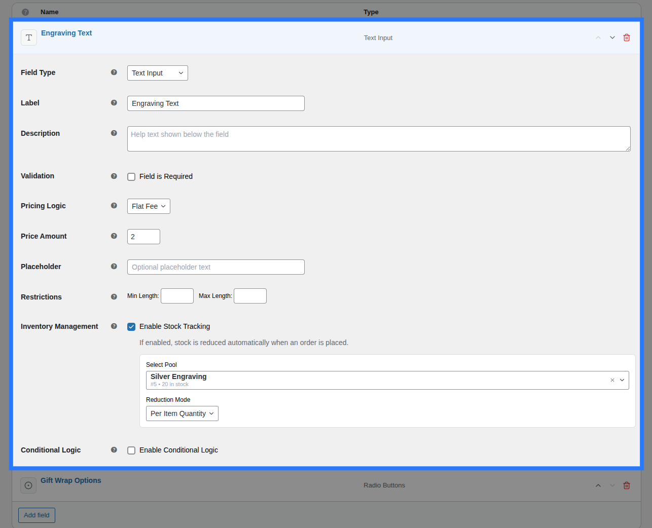
Click on any field row (or its chevron) to expand its full configuration panel. The panel is organized into tabs. The exact tabs available depend on the field type, but the common structure is:
- General: Core display settings — Label, Description, Placeholder, Options (for choice fields), Layout, and Validation (Required, Min/Max Length, etc.).
- Pricing: Attach a price adjustment (Flat Fee, Percentage, Per Character, or Math Formula). For choice fields, pricing is configured per-option inside the General tab instead. Read the Pricing Guide →
- Stock: Link this field (or individual choices) to a Global Stock Item with a reduction mode. Read the Stock Guide →
- Conditions: Define rules to dynamically show or hide this field based on other field values. Read the Conditions Guide →
Detailed Field Documentation
Each field type has its own dedicated documentation page explaining every input, restriction, and configuration option in detail. Click any field type link in the Add Fields Sidebar section above to jump to its full reference.
Deleting a Field
Click the trash icon (🗑) on the right side of any collapsed field row to remove it. The field disappears from the list immediately, but the deletion is not permanent until you save the group. If you accidentally delete a field, simply navigate away without saving (the browser will prompt you) and re-open the builder to restore the previous state.
Saving & Validation
Click the Save / Update Group button in the header bar to persist all changes. Before saving, Smart Product Options and Addons runs a comprehensive validation pass:
- Group Title must not be empty.
- Assignment Rules must have at least one target (when in Targeted mode).
- Field Labels must not be empty for fields that require them.
- Choice Options (for Select, Radio, Checkboxes, Swatches) must have at least one option defined.
If validation fails:
- The first field with an error is automatically expanded so you can see the problem.
- Inline error messages appear directly below the problematic input.
- A toast notification at the top lists up to 3 errors for quick scanning.
Unsaved Changes
If you navigate away with unsaved changes, a browser confirmation dialog will warn you before leaving the page.
Duplicating a Group
You don't need to rebuild common configurations from scratch. From the Option Groups list, hover over any group row and click Duplicate.
Smart Product Options and Addons creates a complete copy — same fields, same settings, same assignment rules — with "(Copy)" appended to the title. The duplicate starts in the same status (Published/Draft) as the original.
This is especially useful when you want to create similar option sets for different product categories with minor tweaks.