
General Settings
What The General Section Controls
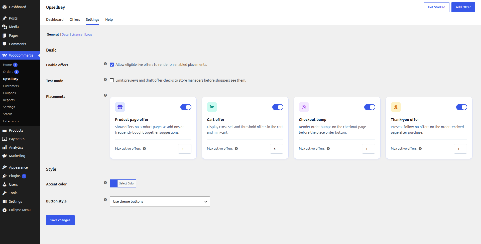
Section titled “What The General Section Controls”Go to WooCommerce -> UpsellBay -> Settings (-> General) to manage the controls that affect all storefront offer rendering.
This section combines two kinds of settings:
- operational controls that decide whether UpsellBay is allowed to run
- presentation controls that keep offers visually aligned with the storefront
Use the General section when you need to pause offer rendering, limit where offers can appear, tune how many offers can show at once, or lightly adjust the offer UI without rebuilding your theme.
Enable Offers
Section titled “Enable Offers”This is the global master switch for shopper-facing UpsellBay offers.
What it means:
Enabledmeans eligible active offers can render on placements that are also enabled.Disabledmeans UpsellBay stops rendering shopper-facing offers across the storefront.
What it does not change:
- it does not delete offers
- it does not change individual offer status
- it does not erase analytics or logs
When to use it:
- before a planned campaign pause
- during theme, checkout, or merchandising maintenance
- while troubleshooting storefront output without editing every offer
Test Mode
Section titled “Test Mode”Test Mode is the safest way to review offer behavior before exposing it to live shoppers.
What it means:
- store managers and admins can preview and validate offers
- live shoppers should not see test-only offer behavior while the mode is active
When to use it:
- during first-time setup
- before publishing a new placement
- after changing copy, products, discounts, or targeting rules
- while comparing theme or checkout changes against existing offer layouts
Why it matters:
- it reduces the chance of showing unfinished or misconfigured offers
- it gives you a controlled review path for QA and merchant approvals
- it works well with draft offers and preview testing
Placements
Section titled “Placements”The placement cards are global gates. An individual offer still needs to be active, eligible, and assigned to the matching placement, but the placement must also be enabled here.
What each placement card includes:
- an on or off toggle for the placement
- a Max active offers limit for that placement
If a placement is turned off here, no offer assigned to that placement renders, even if the offer itself is active and otherwise valid.
Product page offer
Section titled “Product page offer”Use this toggle to allow UpsellBay to render product-page offers near the product form and evaluation flow.
Best for:
- accessories
- frequently bought together offers
- setup add-ons
Why use it:
- shoppers are still evaluating the main product
- this is a natural place to offer complementary items before cart review
- the offer can feel like a helpful add-on rather than a separate promotion
Cart offer
Section titled “Cart offer”Use this toggle to allow offers in cart review contexts.
Best for:
- cross-sells
- bundle completion suggestions
- threshold-helper offers
Why use it:
- the shopper has already shown purchase intent
- cart is a strong place to recommend items that complete the order
- it works well for utility, accessory, or low-risk add-on suggestions
Checkout bump
Section titled “Checkout bump”Use this toggle to allow checkout bumps near the order submission step.
Best for:
- one focused add-on
- low-friction, low-complexity products
Why use it:
- checkout is the strongest place for a single, obvious add-on
- limiting choice here helps avoid payment-area clutter
- it keeps the offer native to the existing WooCommerce checkout flow
Thank-you offer
Section titled “Thank-you offer”Use this toggle to allow thank-you page follow-on offers after the primary order is complete.
Best for:
- refill offers
- post-purchase second-order prompts
Why use it:
- the first order is already complete
- it gives you a safe place to promote a second purchase
- it works well for replenishment or compatible follow-up items
Max Active Offers
Section titled “Max Active Offers”Each placement card includes a Max active offers value. This controls how many eligible offers may appear at the same time in that placement.
What it means:
- lower values keep the storefront focused
- higher values allow more variety but increase the risk of clutter
- if more offers are eligible than the limit allows, offer priority decides which ones win
Recommended starting points:
- product page:
1 - cart:
1to3 - checkout:
1 - thank-you:
1
When to increase it:
- when you have clearly segmented offers with narrow rules
- when the cart placement needs room for more than one relevant recommendation
When to keep it low:
- when the placement is visually tight
- when broad rules could make too many offers compete
- when you want the experience to feel curated rather than promotional
Accent Color
Section titled “Accent Color”Accent Color is the global style token used for UpsellBay UI accents.
What it affects:
- visual accents on offers
- highlights that help the offer feel branded without replacing your theme layout
Legibility & Contrast: UpsellBay automatically calculates a contrasting text color (either white or dark gray) for elements rendered on top of the accent color background based on its relative luminance. This ensures that text on buttons, badges, and tag elements remains readable regardless of whether you choose a light or dark accent color.
When to use it:
- when the default accent does not fit the storefront
- when you want a light brand alignment without custom CSS
- when you need a cleaner visual match across product, cart, checkout, and thank-you placements
Why it exists:
- it gives stores a safer branding control than fully custom templates
- it helps keep offers native-looking while still recognizable as part of the store design
Button Style
Section titled “Button Style”Button Style controls how UpsellBay action buttons should appear relative to the theme.
Available options:
Use theme buttonsOutline
Use theme buttons
Section titled “Use theme buttons”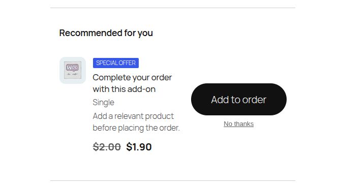
What it means:
- offer buttons inherit the storefront’s normal button style
When to use it:
- when you want the most native-looking experience
- when your theme already has strong accessible button styling
- when you do not want offers to visually compete with the rest of the page
Outline
Section titled “Outline”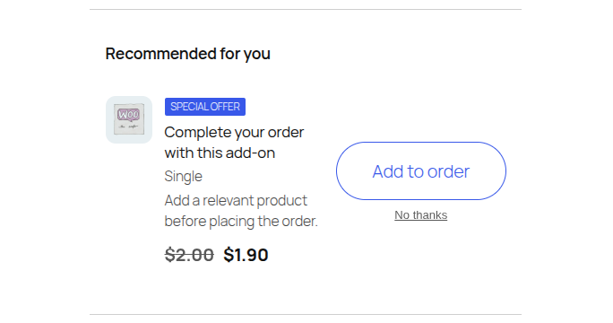
What it means:
- offer buttons render with a lighter outline treatment
- by default, outline button text uses the storefront’s standard text color instead of the accent color to maintain legibility. On hover, the button fills with the accent color and changes the text color to the dynamically calculated contrasting color.
When to use it:
- when theme buttons are too visually heavy inside offers
- when you want the offer CTA to feel secondary to the page’s main purchase action
- when the storefront already has strong color emphasis and the offer should stay visually restrained
Recommended Defaults
Section titled “Recommended Defaults”- keep Enable offers on only when you are ready for live traffic
- keep Test mode on until offer previews are complete
- start with low Max active offers values
- use theme buttons unless your current theme makes offer CTAs feel too dominant
- change Accent Color only when the default clearly clashes with the storefront
General Section Checklist
Section titled “General Section Checklist”Review this section when:
- offers are not showing where you expect
- too many offers are appearing at once
- you need to pause storefront merchandising quickly
- you are preparing a new campaign for review
- offer styling feels out of place with the current theme