Column Editor
The Column Editor lets you choose which data columns appear in your product table, arrange their order, and control responsive visibility.
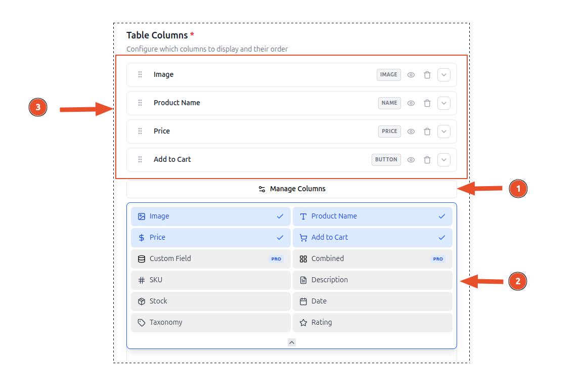
- Clicking on Manage Columns button will open the column editor.
- Select or deselect columns to include in the table.
- Selected Columns will appear in the table in the order they are arranged.
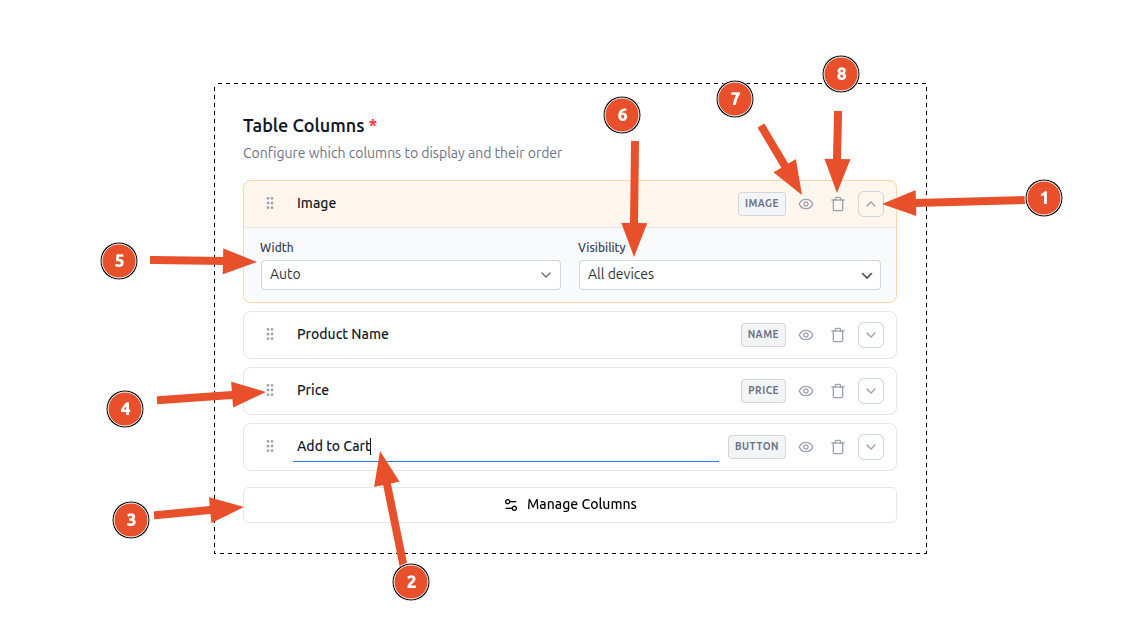
- Open column settings by clicking on the chevron expand button on the right side of any column card.
- You can edit a column name by clicking on the column name text field.
- You can open column editor by clicking on the Manage Columns button.
- You can reorder columns by dragging and dropping them in the column list on the left side of the column editor.
- Set the column width by clicking on the width dropdown on the right side of any column card.
- Set the column visibility by clicking on the visibility dropdown on the right side of any column card.
- You can also hide or show a column name on the table header by clicking on the eye icon on the right side of any column card.
- You can remove a column by clicking on the trash icon.
Available Columns
ProductBay includes a variety of column types to build your perfect product table.
Product Image
Displays the product's featured thumbnail. Optionally includes a built-in lightbox for full-size viewing on click.
Product Name
The product title, linked directly to the single product page.
Price
The current price of the product, appropriately formatted with strike-throughs for products on sale.
SKU
The Stock Keeping Unit of the product.
Description
The product's short description (summary).
Stock Since v1.2.0
Displays the product's stock status (In Stock, Out of Stock, On Backorder) and optionally the exact stock quantity.
Date Since v1.2.0
Shows the product's published date or last modified date, formatted according to your WordPress date settings.
Taxonomy Since v1.2.0
Displays terms from any registered taxonomy, such as standard Categories and Tags, or any custom taxonomy you've registered.
Rating Since v1.2.0
Renders the average customer review rating. Three display formats are available:
| Format | Description |
|---|---|
| Stars (Custom) | Visual star icons styled by ProductBay (default) |
| Text Based | Numeric rating displayed as text (e.g., "4.5 / 5") |
| WooCommerce Default | Uses WooCommerce's native rating template |
To change the display format, expand the Rating column's settings panel and select a format from the Display Format dropdown.
Custom Field PRO Since v1.2.0
Display any product meta field, Advanced Custom Fields (ACF) data, or WooCommerce internal data. Includes intelligent auto-formatting for images, links, dates, and numbers. Read the full Custom Field guide →
Combined Column PRO Since v1.2.0
Merge multiple data points into a single column using a powerful template syntax. For example, combine a product's SKU and Stock status into one cell. Read the full Combined Column guide →
Adding & Removing Columns
- Toggle columns on/off using the checkboxes in the column list
- At least one column must be active
Drag-and-Drop Reordering
Columns can be reordered by dragging them in the column list. The order in the editor corresponds directly to the order in the rendered table (left to right).
The live preview updates instantly as you rearrange columns.
Column Settings
Each column card can be expanded to reveal advanced settings. Click the chevron expand button on the right side of any column card.
Column Heading
Every column has an inline editable heading — click the text on the column card to rename it. Additionally, you can toggle the heading's visibility using the eye icon:
- Eye open — Heading text is displayed in the table header row
- Eye closed — The column header cell is empty (useful for icon-only columns like Image)
Column Width
Control the width of each column with three options:
| Mode | Description |
|---|---|
| Auto | The browser distributes width automatically based on content (default) |
| px | Fixed width in pixels (e.g., 150px) |
| % | Percentage of the total table width (e.g., 25%) |
Responsive Visibility
For each column, you can configure when it appears using seven visibility modes:
| Mode | Description |
|---|---|
| All devices | Visible on all screen sizes (default) |
| Desktop only | Visible only on large screens (≥1024px) |
| Tablet only | Visible only on medium screens (768px–1023px) |
| Mobile only | Visible only on small screens (<768px) |
| Hide on mobile | Visible on desktop and tablet, hidden on mobile |
| Hide on desktop | Visible on tablet and mobile, hidden on desktop |
| Hidden | Always hidden — useful for temporarily removing a column without deleting it |
TIP
Start with all columns visible on desktop, then progressively hide non-essential columns for smaller screens. The most critical columns (Name, Price, Add to Cart) should typically remain visible across all devices.
Cart Column
When add-to-cart is enabled in the Options step, a cart action column is automatically appended to your table. This column includes:
- Add to Cart button for simple products
- Variation selectors for variable products
- Quantity input (if enabled)
- Bulk select checkbox for bulk add-to-cart