Guided Wizard
The Guided Wizard is designed to make building product tables effortless, whether you're a first-time user or an experienced administrator.
Entry Points
Welcome Wizard
When you first install and activate ProductBay, the Welcome Wizard automatically launches to guide you through creating your very first table. This ensures you can get a table live on your site in under a minute.
Floating Action Button
A Floating Action Button (FAB) is available at the bottom-right corner of the admin panel. Click this button at any time to quickly launch the wizard and start a new build.
Wizard Steps
The wizard consists of 5 focused steps:

- Setup — Name your table and choose a product source
- Columns — Select and arrange the columns to display
- Display — Customize the visual design
- Options — Configure behavior and features
- Finish — Review and publish
You can navigate between steps freely, changes are preserved as you move back and forth.
Step 1: Setup
Table Name
Give your table a descriptive name. This is for your reference only — it's not shown on the frontend.
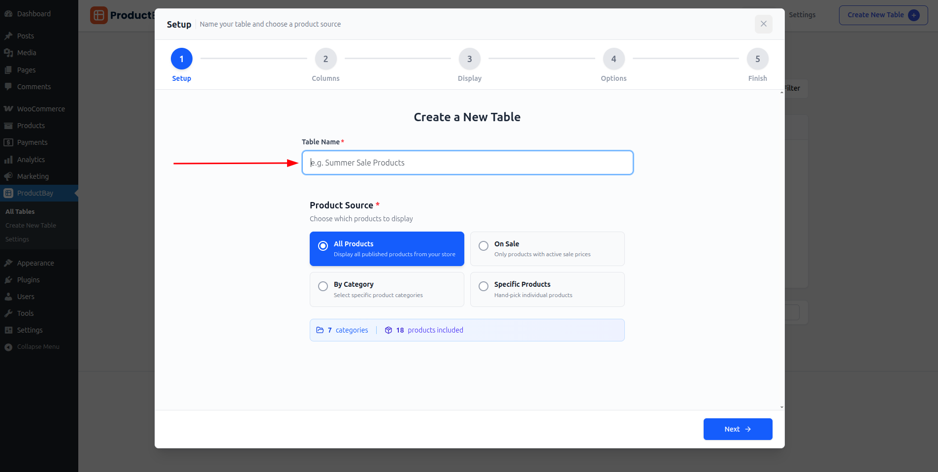
Product Source
Choose where your products come from:
| Source | Description |
|---|---|
| All Products | Displays all published products in your WooCommerce store |
| On Sale | Only products currently on sale |
| By Category | Select one or more product categories |
| Specific Products | Hand-pick products by searching name, ID, or SKU |
Source: Category
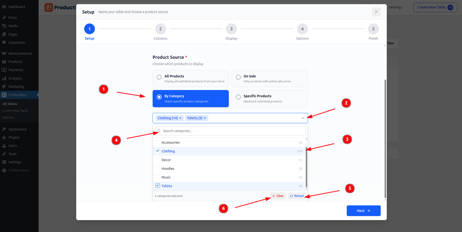
- Select 'By Category' as source
- Open/Close category list
- Select/deselect catrgories
- Search category
- If needed, reload categories
- Clear all selected categories
Source: Specific Products
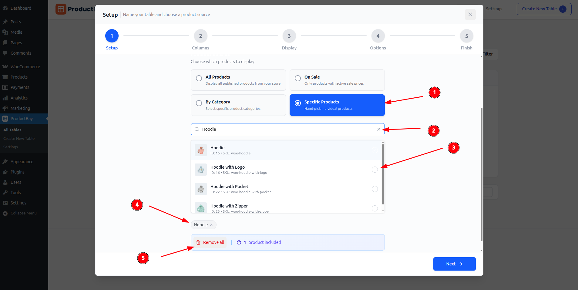
- Select 'Specific Products' as source
- Search products by name, id or sku
- Select desired product(s)
- See selected product(s), you can also remove any selected product from here.
- Remove all selected product
TIP
For each source type, you'll see live statistics showing how many products and categories match your selection.
Default Sort Order
Configure how products are initially sorted:
- Name (A-Z or Z-A)
- Price (Low to High or High to Low)
- Date (Newest or Oldest first)
- Popularity
Step 2: Columns
Available Column Types
| Column | Description |
|---|---|
| Image | Product thumbnail image |
| Name | Product title (linked to product page) |
| Price | Current price (including sale prices) |
| SKU | Stock Keeping Unit identifier |
| Summary | Product short description |
| Stock v1.2.0+ | Stock status indicator |
| Date v1.2.0+ | Product published date |
| Taxonomy v1.2.0+ | Terms from any registered taxonomy |
| Rating v1.2.0+ | Average customer review rating |
| Custom Field PRO v1.2.0+ | Any product meta field or ACF data |
| Combined PRO v1.2.0+ | Merge multiple data points into one cell |
Drag-and-Drop Reordering
Drag columns to change their display order. The live preview updates instantly.
Responsive Visibility
For each column, you can configure visibility across seven modes — from "All devices" (default) to device-specific options like "Desktop only", "Hide on mobile", or "Hidden". See Column Editor — Responsive Visibility for the full list.
This lets you create streamlined mobile layouts by hiding less essential columns.
Step 3: Display
The Display step gives you full control over the visual appearance of your table. See Design Customization for detailed documentation.
Key areas:
- Header styling (background, text color, font weight, text transform)
- Body styling (background, text, alternating rows toggle)
- Button styling (colors, hover colors)
- Layout (border style, border radius toggle, cell padding)
- Hover effects (row hover toggle with custom colors)
Step 4: Options
Table Controls
- Search — Enable the AJAX search bar
- Pagination — Enable paginated results
- Image Lightbox — Enable full-size image popup on click
Pagination Settings
- Products per page — Set how many products display per page (default: 10)
- Pagination Style — Choose between Standard (numbers), Load More button PRO, or Infinite Scroll PRO
Taxonomy & Type Filters
- Enable Categories Filter — Show a category dropdown filter
- Enable Product Type Filter — Show a product type dropdown (Simple, Variable, etc.)
Cart Functionality
- Enable Add to Cart — Show add-to-cart buttons
- AJAX Add to Cart — Add to cart without page reload
- Show Quantity Selector — Display quantity input fields
- Variation Badges — Show badges indicating which variations were added
- Show Clear All Button — Display a button to clear all selected products
- Selected Items View Panel — Show a floating summary of selected items
Variable & Grouped Products
- Variable Product Mode — Choose display mode: Inline Dropdown (Free), Popup Modal PRO, Nested Rows PRO, or Separate Rows PRO
- Grouped Product Mode — Choose display mode: Inline Dropdown (Free), Popup Modal PRO, Nested Rows PRO, or Separate Rows PRO
- Show Options Count — Display "X options available" subtitle on parent products
- Expand Nested Rows PRO — Start nested rows expanded by default (only when Nested mode is selected)
Step 5: Finish
The final step provides:
- A summary of your table configuration
- The option to set the table status (Published or Private)
- A Publish / Update button
After publishing, a confetti animation celebrates your success! 🎉 You'll also see the shortcode to copy and embed.
Editing an Existing Table
To edit a table, click Edit from the Table Dashboard. The wizard opens with all your existing settings loaded, and you can modify any step.